A good way to kill conversions is to annoy customers. One of the biggest annoyances of customers is when they spot a product they're interested in on the overview page, then go in to only see that it is out of stock.
You could of course choose to un-list the products that are no longer in stock, but that can potentially hurt your SEO. If you'll get the product back in stock at some point it is always best to keep the product listing available. Plus for past customers it is nice to re-view the product they've bought online.
A good way to remove the annoyance is to show a 'Out of Stock' message directly on the overview page. The customer will get a lot less annoyed when they are already aware that the product they're about to view is no longer available. If you allow for backordering, all the better!
Using CSS to show a 'Out of Stock' message
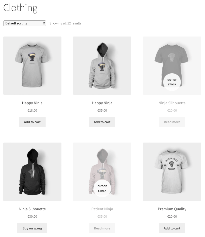
Using a CSS snippet you can easily create a overlay that shows which products are out of stock. Using the following code snippet you can accomplish the following result.
.outofstock:before {
	content: "";
	background: rgba(255,255,255,0.5);
	width: 100%;
	height: 100%;
	position: absolute;
	left: 0; top: 0;
}

.outofstock:after {
	content: "OUT OF STOCK";
	position: absolute;
	background: rgba(255, 255, 255, 0.9);
	border-radius: 100%;
	text-align: center;
	width: 70px;
	height: 70px;
	top: calc(50% - 35px);
	left: calc(50% - 35px);
	font-size: 0.8em;
	font-weight: bold;
	display: flex;
	align-items: center;
}
This should give a result that looks similar to the following.

I was shooting for a nicely centered 'Out of Stock' text, but as it turns this isn't possible with the default WooCommerce templates because of how its structured. If this fits your store, go for it, this is by far the easiest way of setting this up.
Completely center the Out of Stock
There is also a solution to center it! By adding a small PHP code snippet it is possible to add a new element to the page, allowing us to vertically center the text as desired. This also requires a small change in the CSS snippet, so both can be found below.
add_action( 'woocommerce_before_shop_loop_item_title', function() {
 ?><div class="woo-thumbnail-wrap"><?php
}, 9 );
add_action( 'woocommerce_before_shop_loop_item_title', function() {
 ?></div><?php
}, 11 );
.woo-thumbnail-wrap { position: relative; }
.outofstock .woo-thumbnail-wrap:before {
	content: "";
	background: rgba(255,255,255,0.5);
	width: 100%;
	height: 100%;
	position: absolute;
	left: 0; top: 0;
}

.outofstock .woo-thumbnail-wrap:after {
	content: "OUT OF STOCK";
	color: #333;
	position: absolute;
	background: rgba(255, 255, 255, 0.9);
	border-radius: 100%;
	text-align: center;
	width: 70px;
	height: 70px;
	top: calc(50% - 35px);
	left: calc(50% - 35px);
	font-size: 0.8em;
	font-weight: bold;
	display: flex;
	align-items: center;
}
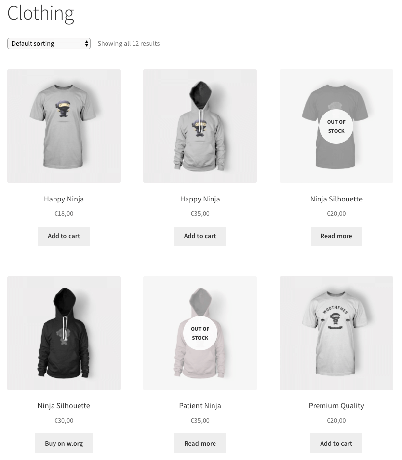
Using these two PHP / CSS code snippets should result in the following.


