As you may have read before elsewhere, removing the navigation menu from cart and checkout pages potentially increase your conversion rates significantly. Giving customers less distraction and less choices will help direct them in the right direction.
In my opinion you don’t want to completely block them off from the rest of your site and never allow them to shop more before completing; just don’t have a full/busy menu and direct customers to the checkout page instead.

As you can see above, Amazon’s checkout page has no navigation menu anywhere and keeps it completely distraction free.
Hiding the Navigation Menu on the Cart Page
The following code snippet removes the navigation menu on the cart page alone.
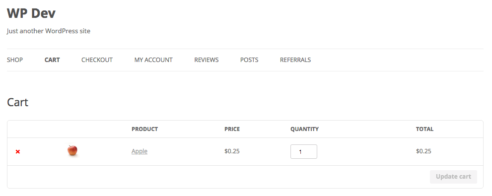
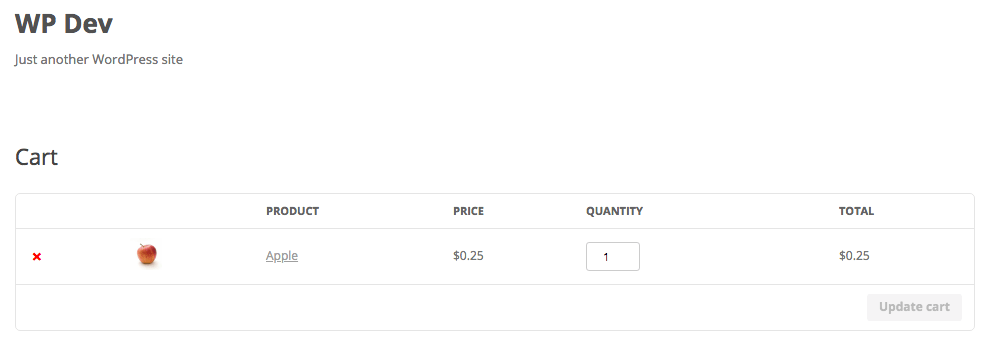
Here’s a before and after example of the cart page with the menu present and removed.
Hiding the Navigation on the Checkout Page
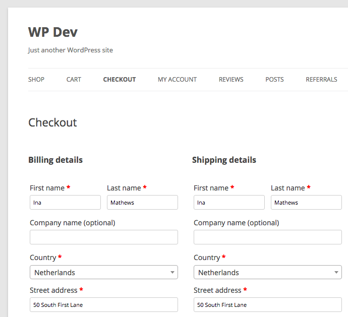
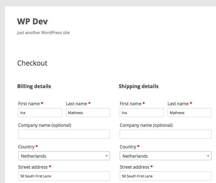
The snippet for removing the navigation the checkout page is very similar to the snippet of the cart.
And the before/after screenshots;

Where to add the code you shared? Which file?
This is awesome. I used it to hide the navigation on my cart page. I’d also like to hide the footer on the cart page only. You don’t have a snippet for this do you?
Hi Craig,
Glad to hear :-) Unfortunately don’t have a snippet readily available for that, but can of course be created. Feel free to reach out if you need assistance with that.
Cheers,
Jeroen